RoomConnect
Timeline
My Role
Oct - Dec ‘23
UX Designer & Researcher


This project aims to help individuals maintain emotionally connected relationships over long distances by providing tools for consistent communication across time zones. Addressing challenges identified in research and interviews, it focuses on overcoming the difficulties of synchronizing calls and the impersonal nature of asynchronous communication.
Introduction
Syncing Hearts Across Time
Innovating Beyond the Status Quo
Tackling a Saturated Market with a Fresh Approach
This project presented a significant challenge;
devising an innovative solution in a market saturated with established communication apps like WhatsApp, Microsoft Teams, and FaceTime.


These platforms, with their user-friendly interfaces and large user bases, already offered calls, video chats, and texts, making it tough to introduce a novel concept.
Despite the convenience of these existing apps, our research identified specific pain points, particularly in managing time zone differences and the impersonality of current synchronous communication methods.


Our task was to think outside the box, to create a personal, shared space in the communication experience that differed from existing platforms. This required a deep understanding of user needs and an unconventional approach to design.
The goal is to enable people to maintain strong, emotionally connected bonds with loved ones, reducing feelings of disconnection and loneliness, and improving social and mental health.


The result was the creation of virtual rooms for asynchronous intimacy, addressing these unique challenges with timezone-aware features and shared spaces for emotional connections.
This experience not only tested our creativity and problem-solving skills but also significantly enhanced my abilities as a UX designer, teaching me the importance of innovative thinking in a competitive and evolving market.
Cracking the Code
Understanding the Emotional Barriers of Remote Relationships
Navigating the problem space involved conducting interviews and extensive research to understand the challenges of maintaining emotionally connected relationships over long distances.
Initial Interviews
We interviewed 10 individuals who rely on digital communication tools to stay connected with distant friends and family.
Our interview protocol included questions to understand the emotional and practical aspects of long-distance communication.
What communication challenges do you face?
Do time zone differences affect your communication?
Describe any communication misunderstandings you've experienced
How does distance affect your relationships emotionally?
What we asked
Interview Findings
The impersonal nature of technology leads to communication struggles and feelings of loneliness and disconnection.
Time zone differences make it difficult to schedule calls, leading to missed connections.
Missing everyday interactions with loved ones is a common experience.
Older family members often struggle to adapt to new communication technologies.
Our deep dive into long-distance communication uncovered a universal truth: the true challenge lies not just in staying connected, but in feeling connected.
Bridging the Emotional Gap
Insights the Shaped our Vision
Challenges
90% people have at lease one long distance relationship. Understanding emotions and coordinating across time zones are major hurdles.
Communication Preferences
People desire real-time interaction but often settle for less due to scheduling conflicts.
The Power of Personalization
Adding personal touches to virtual spaces can significantly improve emotional connection and social interaction.


Our research revealed a need to transcend traditional communication platforms. We sought to create virtual spaces that fostered intimacy and spontaneity, mirroring in-person interactions while addressing time zone challenges and user diversity.
After extensive brainstorming, we decided to go ahead with virtual rooms with timezone-aware features and shared spaces for personal expression, designed to enhance emotional connection and replicate meaningful interactions often missed in long-distance relationships. This approach significantly deepened our understanding of long-distance communication nuances and guided us towards an innovative, inclusive solution.
Our research identified the critical need for personalization and emotional connection in long-distance communication, driving the creation of innovative, user-centric features.
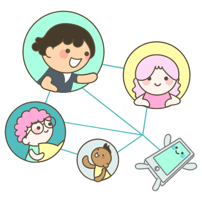
Designed with specific user groups in mind, our platform caters to young adults away from home, including students and professionals aged 18-35, as well as parents and grandparents who miss loved ones afar, typically aged 45 and older.


We have prioritized simplicity to accommodate the less tech-savvy, ensuring ease of use across all ages.
Additionally, our design aims to connect extended families and friends spread across different time zones, effectively bridging distances and enhancing connectivity.

Uniting Loved Ones
Designed for Every Generation
Core Features
Enhancing Long-Distance Relationships with Thoughtful Design
Virtual Room for One-on-One Interactions
Timezone-Aware Clock
Day/Night Indicator
Co-Customizable Corkboard
Emotional Connection Enhancement
Virtual Room for One-on-One Interactions
Timezone-Aware Clock
Day/Night Indicator
Co-Customizable Corkboard
Emotional Connection Enhancement
When Distance Fades
Story of a Virtual Reunion
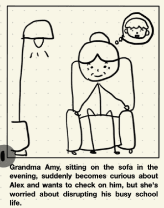

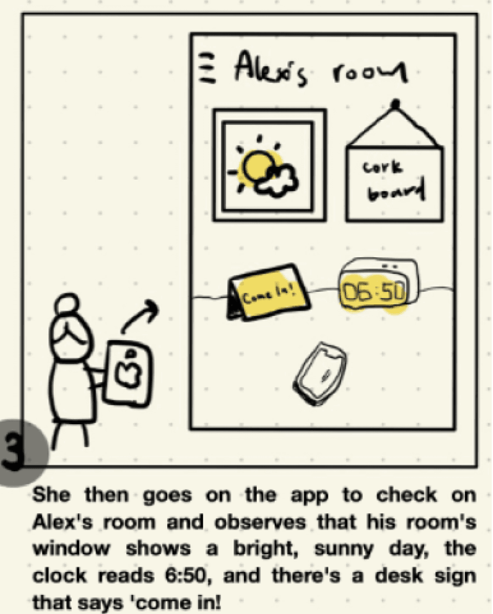


This storyboard depicts the heartwarming connection between a grandmother and her grandson, separated by distance. A simple app helps them bridge the gap, leading to a joyful virtual reunion.
From Paper to Pixels
Crafting the User Journey
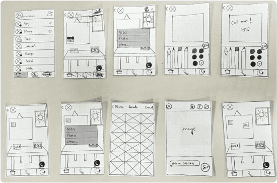
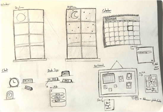
We brainstormed the visual elements and layout of the room, envisioning how different components would contribute to the overall user experience. We then conducted an internal cognitive walkthrough, simulating user interactions with the prototype to identify potential usability issues and areas for improvement.
Walkthroughs revealed usability concerns, such as confusion over profile photo dots, the corkboard's connection to photo albums, and note display duration.


Refining the Experience
Key Adjustments from Internal Evaluations
Challenges with color-coded availability indicators
We initially planned to use color-coded circles to show user availability status.
However, this could cause cognitive overload as users would need to memorize color meanings.
Additionally, color-coding could create accessibility issues for individuals with color vision deficiencies, leading to misinterpretation.

1/4
Challenges with color-coded availability indicators
We initially planned to use color-coded circles to show user availability status.
However, this could cause cognitive overload as users would need to memorize color meanings.
Additionally, color-coding could create accessibility issues for individuals with color vision deficiencies, leading to misinterpretation.

1/4
Sharpening the Vision
Refining our Prototype Through User Feedback
Following our initial internal review of the sketches and wireframes, we developed the first prototype and conducted user evaluations. Insights gained from this initial testing led to revisions and the creation of a second prototype, which underwent further user evaluation. Based on feedback from these sessions, we refined the design and created a third prototype. The following insights are a synthesis of the most significant findings that emerged from this iterative testing process:


6/10
users mistook non-interactive elements like plants for clickable objects
5/10
users found the process for posting notes to the corkboard to be too complex and time-consuming.
8/10
users misunderstood the stereo's functionality, expecting it to control music playback (play/pause) in addition to song selection.
7/10
users initially found the window's function as a day/night indicator for their loved one's timezone to be unclear.
6/10
users mistakenly assumed the clock was displaying their local time instead of their loved one's time.
Final Version
2nd Version
1st Version
The Path Forward
Steps to Elevate RoomConnect
With RoomConnect’s core features in place, our next steps focus on enhancing user experience:
Usability Refinement: We aim to address concerns from cognitive walkthroughs and user evaluations, simplify corkboard interactions, improve navigation, and clarify icons like the day/night window and timezone clock.
Personalized Experience: We aim to expand customization options in virtual rooms, allowing users to add personal touches that reflect their relationships, deepening emotional connections.
Onboarding Guide: We aim to add an onboarding guide to make it easier for new users to adapt to the app, ensuring a smooth introduction to its features.
Designing with Purpose
Essential Lessons from RoomConnect
This project was pivotal in my growth as a UX designer and problem solver. I gained several key insights:
Balancing Innovation with Familiarity: Introducing features like the timezone-aware clock and customizable corkboard required balancing innovation with user-friendliness, highlighting that new ideas must stay rooted in familiarity and ease of use.
Deep User Empathy: Understanding users' emotional nuances in long-distance relationships was key to creating a resonant product, shaping our design and problem-solving strategies.
Holistic Approach: This experience highlighted the value of considering all aspects—technical, emotional, and cultural—to create a solution that meets functional needs and fosters genuine connections.
Feedback-Driven Flexibility: Adapting based on user feedback underscored the importance of being open to change for a better user experience.
Inclusive Design: Designing for all ages emphasized the need for clear, simple interfaces and user guidance.
RoomConnect challenged me to go beyond the ordinary, transforming user pain points into design opportunities that connect people in meaningful ways.
152
HEADING ABC
Sit amet, consectetur adipiscing elit. Nunc vulputate libero et velit interdum, ac aliquet odio mattis.
35.6%
HEADING ABC
Sit amet, consectetur adipiscing elit. Nunc vulputate libero et velit interdum, ac aliquet odio mattis.
296K
HEADING ABC
Sit amet, consectetur adipiscing elit. Nunc vulputate libero et velit interdum, ac aliquet odio mattis.
RoomConnect
Timeline
My Role
Oct - Dec ‘23
UX Designer & Researcher


This project aims to help individuals maintain emotionally connected relationships over long distances by providing tools for consistent communication across time zones. Addressing challenges identified in research and interviews, it focuses on overcoming the difficulties of synchronizing calls and the impersonal nature of asynchronous communication.
Introduction
Syncing Hearts Across Time
Innovating Beyond the Status Quo
Tackling a Saturated Market with a Fresh Approach
This project presented a significant challenge;
devising an innovative solution in a market saturated with established communication apps like WhatsApp, Microsoft Teams, and FaceTime.


These platforms, with their user-friendly interfaces and large user bases, already offered calls, video chats, and texts, making it tough to introduce a novel concept.
Despite the convenience of these existing apps, our research identified specific pain points, particularly in managing time zone differences and the impersonality of current synchronous communication methods.


Our task was to think outside the box, to create a personal, shared space in the communication experience that differed from existing platforms. This required a deep understanding of user needs and an unconventional approach to design.
The goal is to enable people to maintain strong, emotionally connected bonds with loved ones, reducing feelings of disconnection and loneliness, and improving social and mental health.


The result was the creation of virtual rooms for asynchronous intimacy, addressing these unique challenges with timezone-aware features and shared spaces for emotional connections.
This experience not only tested our creativity and problem-solving skills but also significantly enhanced my abilities as a UX designer, teaching me the importance of innovative thinking in a competitive and evolving market.
Cracking the Code
Understanding the Emotional Barriers of Remote Relationships
Navigating the problem space involved conducting interviews and extensive research to understand the challenges of maintaining emotionally connected relationships over long distances.
Initial Interviews
We interviewed 10 individuals who rely on digital communication tools to stay connected with distant friends and family.
Our interview protocol included questions to understand the emotional and practical aspects of long-distance communication.
What communication challenges do you face?
Do time zone differences affect your communication?
Describe any communication misunderstandings you've experienced
How does distance affect your relationships emotionally?
What we asked
Interview Findings
The impersonal nature of technology leads to communication struggles and feelings of loneliness and disconnection.
Time zone differences make it difficult to schedule calls, leading to missed connections.
Missing everyday interactions with loved ones is a common experience.
Older family members often struggle to adapt to new communication technologies.
Our deep dive into long-distance communication uncovered a universal truth: the true challenge lies not just in staying connected, but in feeling connected.
Bridging the Emotional Gap
Insights the Shaped our Vision
Challenges
90% people have at lease one long distance relationship. Understanding emotions and coordinating across time zones are major hurdles.
Communication Preferences
People desire real-time interaction but often settle for less due to scheduling conflicts.
The Power of Personalization
Adding personal touches to virtual spaces can significantly improve emotional connection and social interaction.


Our research revealed a need to transcend traditional communication platforms. We sought to create virtual spaces that fostered intimacy and spontaneity, mirroring in-person interactions while addressing time zone challenges and user diversity.
After extensive brainstorming, we decided to go ahead with virtual rooms with timezone-aware features and shared spaces for personal expression, designed to enhance emotional connection and replicate meaningful interactions often missed in long-distance relationships. This approach significantly deepened our understanding of long-distance communication nuances and guided us towards an innovative, inclusive solution.
Our research identified the critical need for personalization and emotional connection in long-distance communication, driving the creation of innovative, user-centric features.
Designed with specific user groups in mind, our platform caters to young adults away from home, including students and professionals aged 18-35, as well as parents and grandparents who miss loved ones afar, typically aged 45 and older.


We have prioritized simplicity to accommodate the less tech-savvy, ensuring ease of use across all ages.
Additionally, our design aims to connect extended families and friends spread across different time zones, effectively bridging distances and enhancing connectivity.


Uniting Loved Ones
Designed for Every Generation
Core Features
Enhancing Long-Distance Relationships with Thoughtful Design
Virtual Room for One-on-One Interactions
Timezone-Aware Clock
Day/Night Indicator
Co-Customizable Corkboard
Emotional Connection Enhancement
Virtual Room for One-on-One Interactions
Timezone-Aware Clock
Day/Night Indicator
Co-Customizable Corkboard
Emotional Connection Enhancement
When Distance Fades
Story of a Virtual Reunion


This storyboard depicts the heartwarming connection between a grandmother and her grandson, separated by distance. A simple app helps them bridge the gap, leading to a joyful virtual reunion.
From Paper to Pixels
Crafting the User Journey
We brainstormed the visual elements and layout of the room, envisioning how different components would contribute to the overall user experience. We then conducted an internal cognitive walkthrough, simulating user interactions with the prototype to identify potential usability issues and areas for improvement.
Walkthroughs revealed usability concerns, such as confusion over profile photo dots, the corkboard's connection to photo albums, and note display duration.


Refining the Experience
Key Adjustments from Internal Evaluations
Challenges with color-coded availability indicators
We initially planned to use color-coded circles to show user availability status.
However, this could cause cognitive overload as users would need to memorize color meanings.
Additionally, color-coding could create accessibility issues for individuals with color vision deficiencies, leading to misinterpretation.

1/4
Challenges with color-coded availability indicators
We initially planned to use color-coded circles to show user availability status.
However, this could cause cognitive overload as users would need to memorize color meanings.
Additionally, color-coding could create accessibility issues for individuals with color vision deficiencies, leading to misinterpretation.

1/4
Sharpening the Vision
Refining our Prototype Through User Feedback
Following our initial internal review of the sketches and wireframes, we developed the first prototype and conducted user evaluations. Insights gained from this initial testing led to revisions and the creation of a second prototype, which underwent further user evaluation. Based on feedback from these sessions, we refined the design and created a third prototype. The following insights are a synthesis of the most significant findings that emerged from this iterative testing process:


6/10
users mistook non-interactive elements like plants for clickable objects
5/10
users found the process for posting notes to the corkboard to be too complex and time-consuming.
8/10
users misunderstood the stereo's functionality, expecting it to control music playback (play/pause) in addition to song selection.
7/10
users initially found the window's function as a day/night indicator for their loved one's timezone to be unclear.
6/10
users mistakenly assumed the clock was displaying their local time instead of their loved one's time.
Final Version
2nd Version
1st Version
The Path Forward
Steps to Elevate RoomConnect
With RoomConnect’s core features in place, our next steps focus on enhancing user experience:
Usability Refinement: We aim to address concerns from cognitive walkthroughs and user evaluations, simplify corkboard interactions, improve navigation, and clarify icons like the day/night window and timezone clock.
Personalized Experience: We aim to expand customization options in virtual rooms, allowing users to add personal touches that reflect their relationships, deepening emotional connections.
Onboarding Guide: We aim to add an onboarding guide to make it easier for new users to adapt to the app, ensuring a smooth introduction to its features.
Designing with Purpose
Essential Lessons from RoomConnect
This project was pivotal in my growth as a UX designer and problem solver. I gained several key insights:
Deep User Empathy: Understanding the emotional nuances of users in long-distance relationships was essential to creating a product that truly resonated. This empathy shaped our design decisions and problem-solving strategies.
Balancing Innovation with Familiarity: Introducing features like the timezone-aware clock, window, and co-customizable corkboard required a careful balance between innovation and user-friendliness. This taught me that groundbreaking ideas must be anchored in familiarity and ease of use.
Inclusive Design Across Generations: Designing for a diverse age range emphasized the importance of inclusivity. Ensuring older adults could navigate the app as easily as younger users highlighted the need for clear, simple design and comprehensive user guidance.
Adapting Design Based on Feedback: The project reinforced the value of flexibility and responsiveness. Adapting the navigation and interaction flow based on user feedback underscored the importance of being open to change to enhance the user experience.
Holistic Problem-Solving: This experience taught me the importance of a holistic approach to design, considering technical, functional, emotional, social, and cultural contexts. This led to a solution that not only met functional needs but also fostered genuine emotional connections.
RoomConnect challenged me to go beyond the ordinary, transforming user pain points into design opportunities that connect people in meaningful ways.
152
HEADING ABC
Sit amet, consectetur adipiscing elit. Nunc vulputate libero et velit interdum, ac aliquet odio mattis.
35.6%
HEADING ABC
Sit amet, consectetur adipiscing elit. Nunc vulputate libero et velit interdum, ac aliquet odio mattis.
296K
HEADING ABC
Sit amet, consectetur adipiscing elit. Nunc vulputate libero et velit interdum, ac aliquet odio mattis.


RoomConnect
Timeline
My Role
Oct - Dec ‘23
UX Designer & Researcher
152
HEADING ABC
Sit amet, consectetur adipiscing elit. Nunc vulputate libero et velit interdum, ac aliquet odio mattis.
35.6%
HEADING ABC
Sit amet, consectetur adipiscing elit. Nunc vulputate libero et velit interdum, ac aliquet odio mattis.
296K
HEADING ABC
Sit amet, consectetur adipiscing elit. Nunc vulputate libero et velit interdum, ac aliquet odio mattis.
This project reimagines how people maintain emotional connections over long distances. By addressing the challenges of time zone differences and the impersonal nature of asynchronous communication, it introduces tools designed to foster consistent, meaningful interactions. Grounded in research and user insights, the solution focuses on creating a shared emotional experience that bridges the gaps left by traditional communication platforms.
Introduction
Syncing Hearts Across Time
Innovating Beyond the Status Quo
Tackling a Saturated Market with a Fresh Approach
In a world dominated by apps like WhatsApp and FaceTime, we set out to address something these platforms overlook: the emotional side of communication. Time zone challenges and the impersonal nature of virtual interactions leave users feeling disconnected.


We reimagined communication as an emotional experience by designing virtual rooms for asynchronous interactions. These spaces, enhanced with time-zone-aware features, helped users build stronger bonds, combat isolation, and improve emotional well-being.
This experience taught me the power of thoughtful design in transforming everyday interactions, proving there’s always room for innovation when you focus on human needs.

2nd Version
1st Version
Final Version
Final Solution
Sneak Peak
Cracking the Code
Understanding the Emotional Barriers of Remote Relationships
Navigating the problem space involved conducting interviews and extensive research to understand the challenges of maintaining emotionally connected relationships over long distances.
Initial Interviews
Our deep dive into long-distance communication uncovered a universal truth:
the true challenge lies not just in staying connected, but in feeling connected.
Participants:
10 individuals who rely on digital communication to maintain connections.
Groups Represented:
Parents with children living abroad for studies or work.
Children navigating long-distance relationships with their parents.
Objective:
To understand the emotional and practical challenges faced by both groups in staying connected across time zones.
What communication challenges do you face?
Do time zone differences affect your communication?
Describe any communication misunderstandings you've experienced.
How does distance affect your relationships emotionally?
What we asked
Time zones make scheduling calls hard, causing missed connections.
Tech feels impersonal, leading to loneliness and disconnection.
Everyday interactions with loved ones are often missed.
Older family members struggle with new communication tools.
Interview Findings
Bridging the Emotional Gap
Insights the Shaped our Vision
Our interviews and desk research revealed a need to go beyond traditional communication platforms. This insight guided the vision for virtual spaces that foster personalization, emotional connection, and spontaneity, addressing time zone challenges while mirroring the intimacy of in-person interactions.

90% people have at lease one long distance relationship. Understanding emotions and coordinating across time zones are major hurdles.
Insight 1

People desire real-time interaction but often settle for less due to scheduling conflicts.
Insight 2

Adding personal touches to virtual spaces can significantly improve emotional connection and social interaction.
Insight 3
Our platform is designed for diverse user groups: adults aged 18–35 living away from home, and parents or grandparents aged 45+ who miss loved ones afar.


We prioritized simplicity to make it accessible for less tech-savvy users, ensuring ease of use for all ages. By connecting families and friends across time zones, the platform bridges distances and strengthens bonds effortlessly.
Target User Group
Designed for Every Generation
Core Features
Enhancing Long-Distance Relationships with Thoughtful Design
Core features like virtual rooms, a timezone-aware clock, and a co-customizable corkboard are rooted in research, emphasizing personalization and intimacy. Inspired by Griggio et al.'s findings on co-customization, these tools help users stay close to loved ones across time zones while simplifying availability and schedule coordination.
Virtual Room for One-on-One Interactions
Timezone-Aware Clock
Day/Night Indicator
Co-Customizable Corkboard
Emotional Connection Enhancement
When Distance Fades
Story of a Virtual Reunion

This storyboard depicts the heartwarming connection between a grandmother and her grandson, separated by distance. A simple app helps them bridge the gap, leading to a joyful virtual reunion.
From Paper to Pixels
Crafting the User Journey
Walkthroughs revealed usability concerns, such as confusion over profile photo dots, the corkboard's connection to photo albums, and note display duration.


We brainstormed the visual elements and layout of the room, envisioning how different components would contribute to the overall user experience. We then conducted an internal cognitive walkthrough, simulating user interactions with the prototype to identify potential usability issues and areas for improvement.
Refining the Experience
Key Adjustments from Internal Evaluations
Challenges with color-coded availability indicators
We initially planned to use color-coded circles to show user availability status.
However, this could cause cognitive overload as users would need to memorize color meanings.
Additionally, color-coding could create accessibility issues for individuals with color vision deficiencies, leading to misinterpretation.

1/4
Sharpening the Vision
Refining our Prototype Through User Feedback
We started with sketches and wireframes, then created the first prototype and tested it with users. Feedback from these tests guided two more rounds of iterations, leading to a refined third prototype. Here are the key insights from this process:
6/10
users mistook non-interactive elements like plants for clickable objects
5/10
users found the process for posting notes to the corkboard to be too complex and time-consuming.
8/10
users misunderstood the stereo's functionality, expecting it to control music playback (play/pause) in addition to song selection.
7/10
users initially found the window's function as a day/night indicator for their loved one's timezone to be unclear.
6/10
users mistakenly assumed the clock was displaying their local time instead of their loved one's time.
What's Next?
Steps to Elevate RoomConnect
With RoomConnect’s core features in place, our next steps focus on enhancing user experience:
Usability Refinement: We aim to address concerns from cognitive walkthroughs and user evaluations, simplify corkboard interactions, improve navigation, and clarify icons like the day/night window and timezone clock.
Personalized Experience: We aim to expand customization options in virtual rooms, allowing users to add personal touches that reflect their relationships, deepening emotional connections.
Onboarding Guide: We aim to add an onboarding guide to make it easier for new users to adapt to the app, ensuring a smooth introduction to its features.
Takeaways
Essential Lessons from RoomConnect
This project was pivotal in my growth as a UX designer and problem solver. I gained several key insights:
Develop Deep User Empathy: Understanding the emotional needs in long-distance relationships shaped our design approach to create a truly resonant product.
Balance Innovation and Familiarity: Features like the timezone clock and customizable corkboard needed to be innovative yet intuitive, underscoring the importance of user-friendly design.
Adopt a Holistic Approach: This project reinforced the importance of considering technical, emotional, and cultural aspects for meaningful connections.
Stay Flexible with Feedback: User feedback guided adaptations, highlighting the value of being open to change.
Focus on Inclusive Design: Designing for all ages taught me the importance of clear, simple interfaces and supportive guidance.
RoomConnect pushed me to balance innovation with familiarity, and prioritize inclusivity to create meaningful solutions that bridge distances and foster genuine human connections.