12+ daily client capacity
2h → 20m workflow
preferred by the ops team
CONTEXT
What FlairX does
Team
Timeline
Domain
Responsibilities
THE PROBLEM
Scaling limitations
FlairX had demand. Companies wanted in. But they couldn’t scale past 3-4 active clients a day.
The bottleneck: questionnaire creation. Each custom questionnaire took their 3-person ops team 1.5-2 hours to create.
“We can’t take on more than 3-4 clients at once without hiring more people. We’re spending more time creating questionnaires than conducting interviews.”
~Founder/CEO, initial conversation
THE DISCOVERY
What I learned through participatory shadowing
I had 2 weeks to deliver. Spent the first two days watching the CEO and ops team create questionnaires.
Template Avoidance
×
new
Quality Bar
Target zone
Output falls below client expectation
Actual output: generic, low difficulty
No Intelligent System
tag?
hierarchy?
filter?
Inconsistent Quality
Met standard
Below standard
Critical insight
Users weren’t avoiding speed; they were avoiding losing control. Every “fast” solution (templates, full automation) took away their ability to shape the output. So they rejected it.
The challenge was making the process faster while keeping users in control.
COMPETITIVE LANDSCAPE
What others were building
Platforms analyzed
HireVue
Karat
BrightHire
BarRaiser
Intervuew
Metaview
Glider
What they had
AI note-taking
Interview recording
Automated scoring
Static templates
What was missing
Question generation
Smart refinement
Human-in-the-loop
Adaptive workflow
Our opportunity
Build AI-assisted flow that balances automation with editorial control; questions aligned to job descriptions, easy to personalize, with users keeping strategic control.
SETTING THE FOUNDATION
User flow

MAJOR DESIGN DECISIONS
Decisions that shaped the solution
Following core decisions determined whether users would adopt this or reject it like they’d rejected templates.
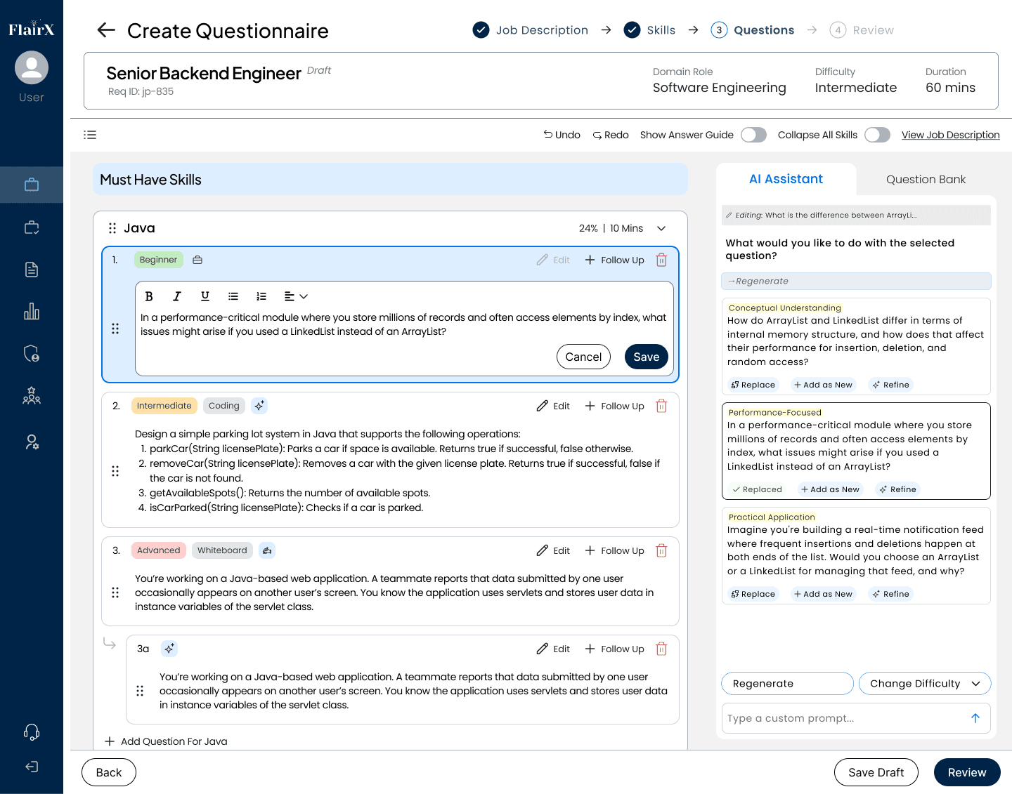
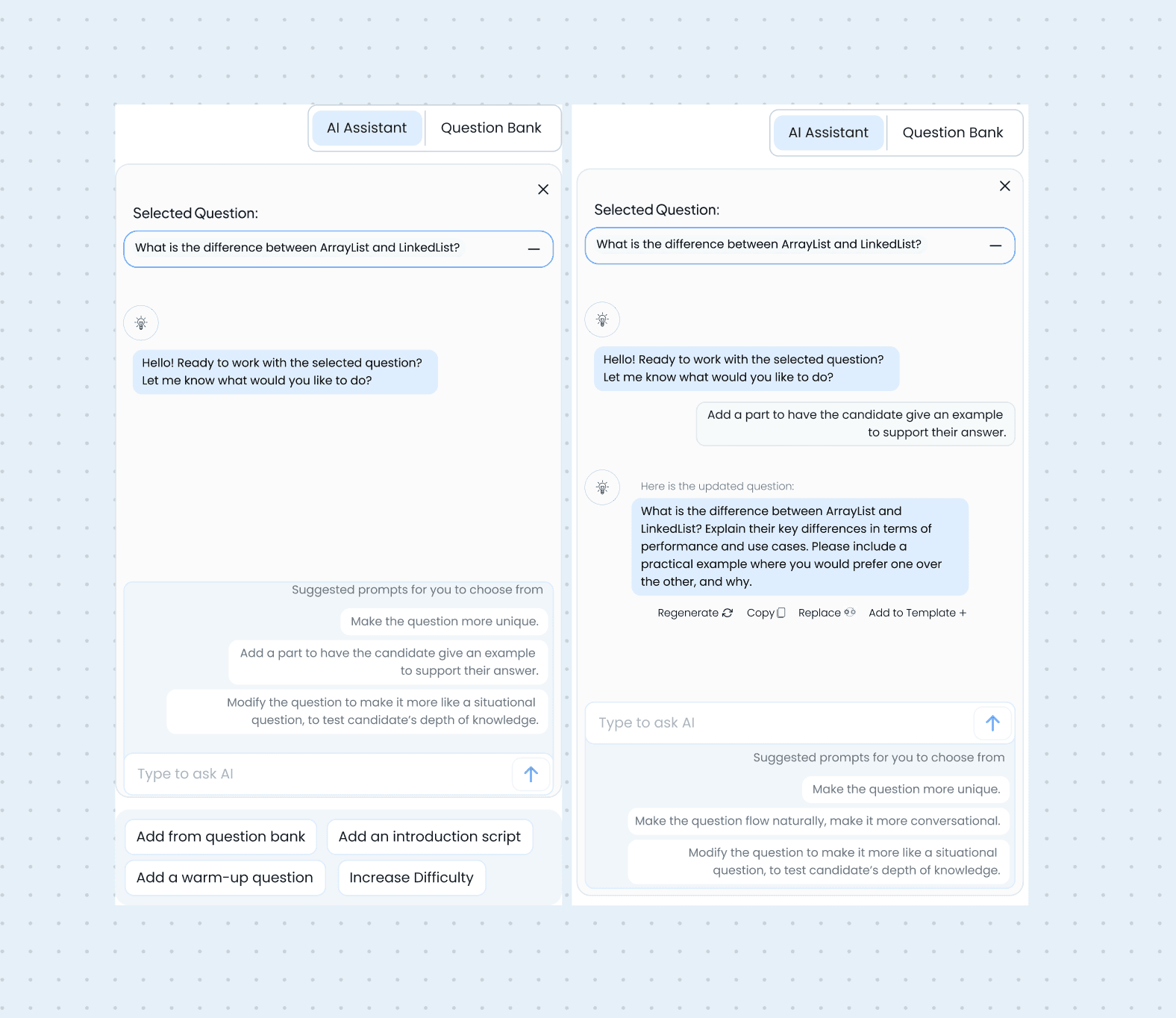
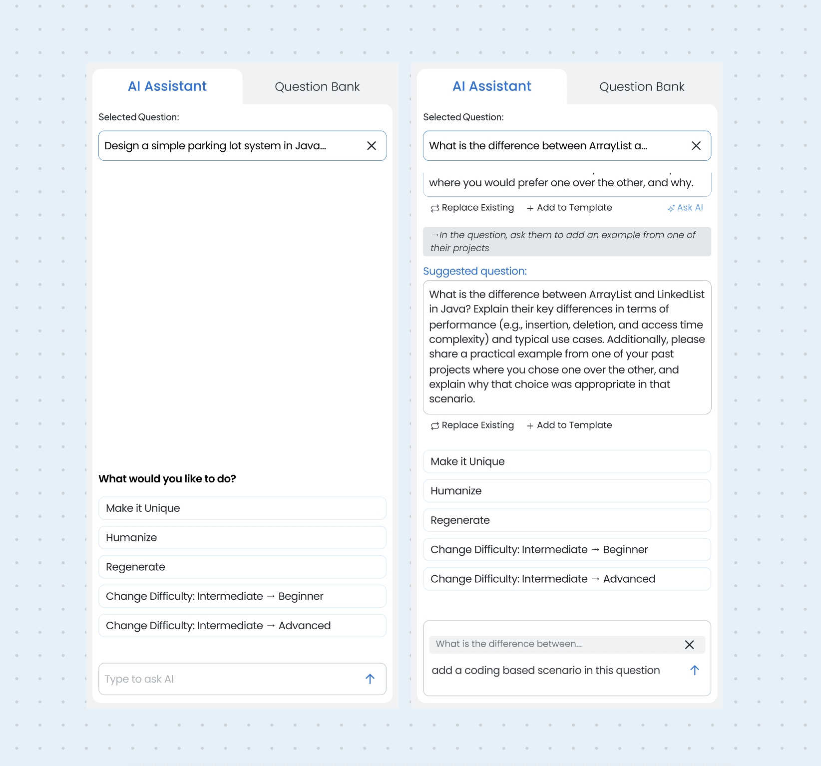
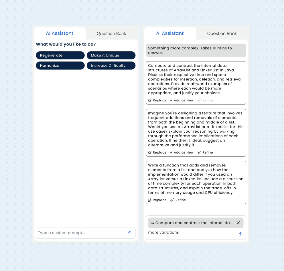
AI assistant panel
Iter 1
Iter 2
Iter 3
Iter 4
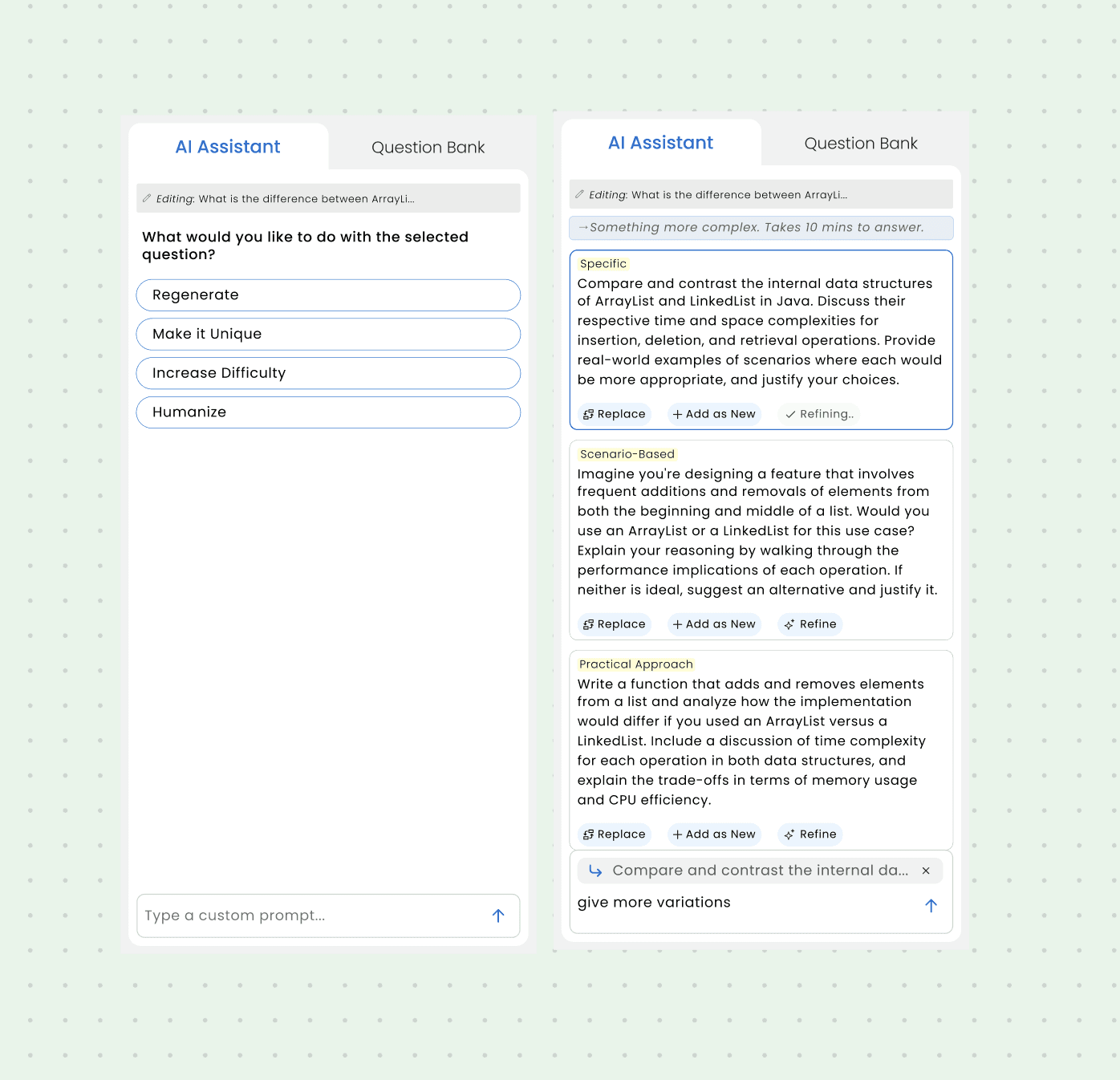
The forcing function
Watching the CEO use the tool for an hour revealed 4 repeated prompts, constraint drove curation instead of infinite options.
What was traded off
Natural language flexibility dropped. But the 4 curated actions cover ~95% of real use cases observed in testing.
Net outcome
Workflow time dropped to 18 min vs open chat. No learning curve. Buttons show what's possible at a glance.
Decision 01 · Skill-first flow
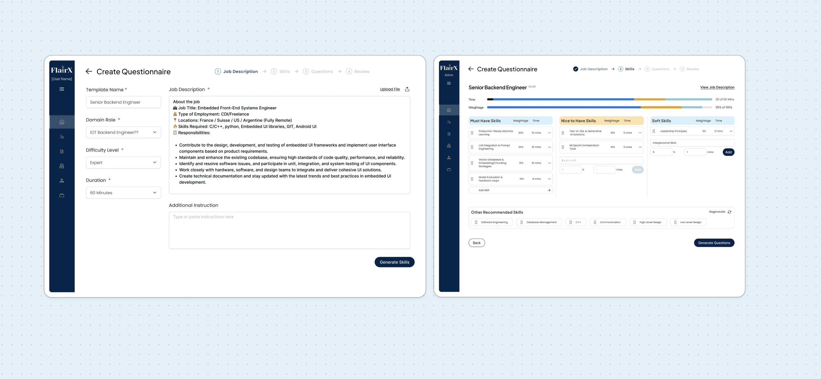
Job Description Parsing + Skills Step
The problem: Manually extracting skills from JDs, typing them into ChatGPT. Time-consuming, error-prone. Questions often misaligned.
What we built: Upload JD → auto-parse skills → review/edit → set weightage/time → generate questions.
This happens before any questions generate. Users shape direction first.
Why this decision
Business impact: Questions aligned to job requirements. Less rework, fewer complaints.
User experience: Control at the right moment. Users loved
reviewing skills before committing. Felt strategic, not reactive.
Tradeoff: Added a step. But users found it helpful, not burdensome; saved time downstream.
Why it’s best: Turned out to be most valuable. Strategic control + automated extraction.
→
The product won trust by giving users strategic control before automation took over.
Decision 02 · STRUCTURED QUESTIONNAIRE
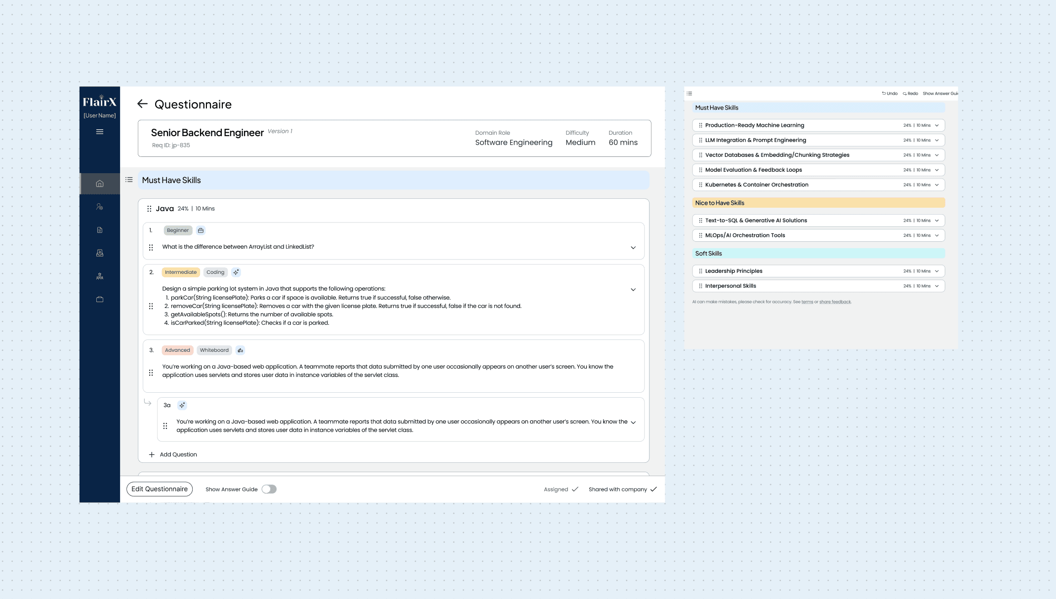
Structure flow, not a canvas
The initial idea: a Notion-style canvas. Drag and drop, build anything, full flexibility.
PM's pushback: "Months of development. We have two weeks."
The compromise: pre-defined sections, guided flow, clear progression, no open-ended build experience.
Why this decision
Business impact: Shipped in 2 weeks vs months. Got to market fast, started learning immediately.
User experience: Lost the "build anything" feeling. Gained clarity; users always knew where they were, with no decision paralysis.
Trade-off: Gave up flexibility for speed and simplicity. Less magical, more learnable.
Why it's best: Shipped fast, users understood it immediately.
→
Speed and clarity beat flexibility when the user base is non-technical and time-to-market matters.
Decision 03 · Question Bank Library
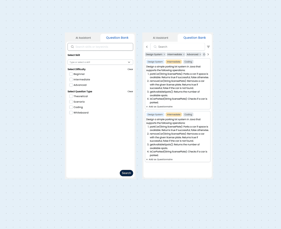
Question Bank Library
The business need: preserve competitive edge through vetted, high-quality questions.
What we built: a searchable question bank with tagging and filtering by skill, difficulty, and type; browse and add directly to a questionnaire.
My honest take: skeptical this gets used much. Usage will decline. People won't update it. They'll lean on AI generation because it is faster and personalized.
Why this decision
Business impact: Competitive differentiator on paper. Shows expert-curated questions, not just AI content.
User experience: Fallback for users who don't fully trust AI yet, or need a specific question they've seen before.
Trade-off: Maintenance effort, potentially low usage.
Why it's included: Business priority, not product necessity. Leadership wanted it. Sometimes you build for strategy despite doubts.
→
Not every feature is built because the designer believes in it. Some are built because the business needs it, and being honest about that is good design thinking too.
THE SOLUTION
Final user flow
A focused walkthrough of the final user flow, from job description intake to skill calibration and question generation.
Strategic control first
Automated extraction
Review before generate
Final workflow demo
↳
The final flow makes AI feel guided: users calibrate requirements before the system generates interview-ready questions.
IMPACT
What changed
Scale
12+ daily clients
Handled by the same 3-person ops team, without new hires.
Time
2h → 20m
Average questionnaire creation time after launch.
Adoption
100% ops
No training, no mandate, the team chose the assistant.
MY TAKEAWAYS
Reflections
Watch what users do, not what they say
The CEO wanted to improve the templates, but watching her revealed she avoided templates and repeated the same ChatGPT prompts. The solution came from observation, not asking.
Constraits force better solutions
Engineering said "no open-ended chat." I resisted, then realized curating most-used actions beat infinite flexibility. Limits reveal what matters.
Control drives adoption more than speed
Users rejected fast solutions that removed control. We shipped the fastest version that kept them in control. That's why they adopted it.
Should've pushed harder for inline editing
We put AI actions in a sidebar. It works, but inline editing would've been more intuitive and saved space.