How I helped FlairX reduce questionnaire creation time from 2 hours to 20 minutes
Designed an AI copilot that cut 70% of manual work while keeping humans in control. Navigated technical constraints, compliance requirements, and a 2-week deadline to ship a product that's now used by every FlairX client.
9x
Faster questionnaire creation flow
70%
Less effort
78%
Increase in user adoption

B2B SaaS / HRTech
Product Designer
2 Designers, 3 Engineers, PM, CEO
2 weeks (1 sprint)
The Challenge
Manual workflow was killing scale
FlairX helps companies outsource technical interviews to vetted experts. When I joined, their ops team was spending 1.5-2 hours creating each interview questionnaire, jumping between 4 different tools: Google Docs for JD analysis, ChatGPT for question generation, Sheets for organization, then seek approval through slack, and then finally FlairX to input everything.
"We can't take on more than 3-4 clients simultaneously without hiring more people."
— FlairX CEO
The brief
Build an AI workflow that cuts time to under 30 minutes while improving quality. Make it compliant with AI hiring laws. Ship in one sprint.
Why this matters?
FlairX's business model depends on volume. Each bottleneck in their workflow directly limits how many clients they can serve. Fixing this would help scale revenue without scaling headcount.

Reseach
2 days of focused discovery
With a 2-week deadline, I spent 2 days understanding the problem. I shadowed the CEO creating questionnaires, studied 10+ competitors (Karat, BrightHire, BarRaiser), researched AI compliance laws, and mapped the complete user flow. What I actually did:
Shadowed the workflow in real-time: I sat with the CEO and ops team while they created questionnaires, watching them switch between Google Docs, ChatGPT, Sheets, and FlairX. This showed me the actual pain points, not just what they said hurt.
Studied 10+ competitors: Karat, BrightHire, BarRaiser, Glider, Metaview. I wasn't looking for inspiration—I was looking for gaps. What did they automate? What did they leave manual? Where was the white space?
Researched AI compliance requirements: NYC's AI hiring law, bias audit requirements, consent rules. I needed to understand the legal constraints before designing features we'd have to rebuild later.
Mapped the complete user flow: Not just the happy path, but every edge case, every decision point, every place where things could go wrong.
Critical insight #1
No competitor offered prompt-driven question building
They either automated everything (losing quality and control) or provided passive tools (not solving the speed problem).
Our opportunity: build an AI copilot that assists without taking over. Give users full editorial control while eliminating the tedious parts.

My Approach
Four findings that shaped the design
Finding #1
Templates were actively avoided
Despite having a library, teams never reused templates. They felt generic and outdated and as a result, they couldn't gather the trust.
→ Implication: AI suggestions had to feel custom, not templated. Context was everything.
Finding #2
Quality expectations were ruthlessly high
Clients expected custom-crafted, high-difficulty questions that proved FlairX understood their domain. Generic suggestions and duplicate questions killed trust.
→ Implication: AI had to generate questions that felt hand-crafted, not mass-produced.
Finding #3
Job descriptions lacked structure
Most JDs were unstructured text with no priorities or time allocations. This forced the team to make assumptions, leading to questionnaires that didn't match what the client actually wanted to test for.
→ Implication: We needed to extract structure from chaos, not just take JDs at face value.
Finding #4
No intelligent assistance existed anywhere
The existing system had no smart recommendations, no tagging, no hierarchy, no difficulty guidance. Everything was manual curation, which was both slow and inconsistent.
→ Implication: Even small bits of intelligence would be a massive improvement.
The design challenge crystallised
Build an AI that generates contextual, high-quality questions while giving users full control to refine, reject, or regenerate
Not a black box. Not a template generator. A copilot that makes users more capable, not dependent.

Design Decisions
The four pivots that defined the product
#1
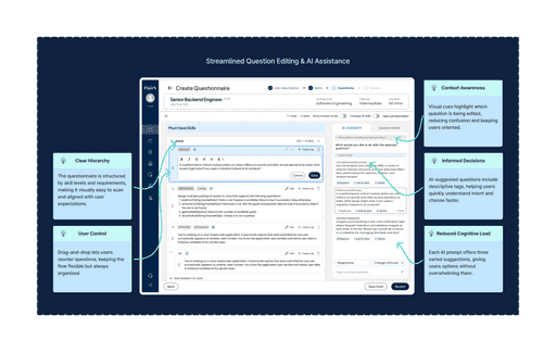
Job description as the anchor
I made the JD foundational. Users configure role, seniority, and instructions before AI generates anything.
→ Context-driven AI is the difference between useful and noise.
#2
Transparent AI with visible controls
Every AI element is clearly labeled. Users can regenerate, edit, or adjust difficulty with one click.
→ Transparency builds trust and ensures compliance.
#3
Skills first, questions second
AI suggests skill categories with time allocations. Users review and adjust before generating questions. Humans drive strategy, AI handles execution.
→ Humans drive strategy, AI handles execution.
#4
Kill the conversational AI
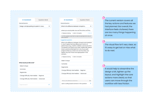
Early versions had a chat interface. CEO feedback: "Users need speed, not conversation." We replaced chat with instant quick actions.
→ The best AI UX is invisible until needed.
What I Rejected
Ideas that didn't make it
Rejected: Auto-complete questionnaire generation
The engineering team suggested we could auto-generate complete questionnaires with one click. It would have been fast, but it would have felt like magic—and not the good kind. Users would have no idea why certain questions were included, and trust would evaporate the moment AI made a bad suggestion.
Why I rejected it: Speed at the cost of control is just a different kind of slow. Users would spend time fixing bad auto-generations instead of creating good ones.
Rejected: Template library with AI search
We considered building a smart template library where AI would recommend existing questionnaires based on the JD. This would have reused existing content, but it wouldn't have solved the core problem: users didn't trust templates.
Why I rejected it: You can't fix a broken system by making it smarter. We needed a new approach, not a better search bar.
Rejected: Conversational AI assistant
As mentioned earlier, we built out a chat interface where users could ask AI to refine questions, suggest alternatives, or explain suggestions. It tested well in theory, but users found it slower than just clicking buttons.
Why I rejected it: The founder was right. Users don't want to chat— they want to act. Quick actions beat conversation every time.
Lesson learned
The best ideas are often the ones you kill. Every rejected concept taught me something about what users actually needed versus what I thought would be cool.

Iteration Process
4 days, 4 rounds, relentless feedback
With a 2-week sprint, I couldn't afford slow iteration cycles. I ran 4 rounds of feedback in 4 days, presenting wireframes daily to the CEO, PM, and dev team. This wasn't comfortable—it was necessary.
Round 1 Feedback
"Narrow the assistant's focus to actionable tasks. Users don't need open-ended chat—they need specific help with specific problems."
Round 2 Feedback
"The layout is too generic. Make it clear what AI can do without making users read documentation. The interface should teach itself."
Round 3 Feedback
"The data flow works, but the UI feels cluttered. Simplify. Every screen should have one clear purpose."
Round 4 Feedback (The Pivot)
"Kill the conversational AI. Users need speed, not handholding. Give them instant actions, not typing prompts."
This rapid feedback cycle only worked because I kept designs lightweight—wireframes, not high-fidelity mockups. I was validating concepts, not polishing pixels. You can't iterate fast if you're precious about your work.
Final Solution
Shipped flow
What we built: JD-driven configuration • Smart skill extraction • One-click refinements • Transparent AI labeling • Full editorial control • Built-in compliance
Design Principle
Make users more capable, not dependent. Every feature enhances human judgment rather than replacing it.


Reflection
What I learned
Constraints breed clarity. A 2-week deadline forced ruthless prioritization. When you can't build everything, you learn what truly matters. Perfect is the enemy of shipped.
The best ideas are often the ones you kill. Every rejected concept taught me about user needs versus designer preferences. Strategic thinking means knowing what not to build.
AI isn't magic—it's a tool. Transparency beats cleverness. Users don't want AI to dazzle them—they want to trust it. Show your work, give users control.
Looking forward
This AI copilot is just version 1. The architecture we created—modular, transparent, human-centered—gives FlairX a foundation to iterate without rebuilding. That's the kind of thinking I bring: systems that scale, decisions that compound, experiences that improve with use.


